Cambridge Blues, Part I
by David B. Rankin
Issue No. 76 - August 1979
Many of us find that trying to properly identify blue colors is the most challenging subject in the study of Cambridge colors. There are four techniques that are used to identify each blue color. No one technique is sufficient. As will become apparent as the series develops, it is necessary to bring all four techniques to bear on some of the Cambridge blues.
The first technique is the most familiar to all of us. Let me call this technique "remembered appearance". This is a fancy way of saying that once a color has been identified for us we remember what it looks like and are able to identify it just by seeing it. This method alone works only when there is not another color close enough to cause confusion.
The second technique involves comparison of two similar items. It is very difficult to generalize the significance of this technique. At this point I will just add one note of caution. The difference in some of the blue colors is not readily apparent under artificial lighting. Indirect natural light is best.
This leads us to the third technique: the use of black light. The use of black light is very useful because of the reactive nature of some chemicals used in glass formulas. Much more discussion of black light will be necessary to avoid adding confusion to our study rather than eliminating it.
The final technique involves the matching of item production dates with color dates. The weakness in this technique lies in the uncertainty of the exact production dates of colors and even more questions on many items. Throughout these articles I will be making reference to color and item references in trade advertising because I believe that this provides the best available indication of Cambridge's primary marketing efforts and probably the company's primary production period of a particular color. Successful colors were probably produced beyond this time period to provide a matching service but new lines and articles would not be included. I must emphasize that this is my opinion and you, the reader, must judge this approach for yourself
Before beginning our discussion of the specific blue colors we must lay more ground rules on the use of black light. It became apparent during several discussions at this year's convention that there are a variety of black lights available on the market which may provide results differing from those related in this article. It would be helpful if one of our members would conduct some research on the available black lights to determine which ones provide the desired results and which should be avoided. At this time I can only say that the incandescent type bulbs are of little value and that my observations were made using an 18" florescent tube type made by IMS Corporation identified as IMS 18 BLB (this does not constitute an endorsement of this product). Similar results have been obtained with a 15" Sylvania Black light Blue F1578BLB. Although we believe that the reactions are the same with both tubes, I use the term 'similar' because we have not verified the reactions. Lacking more details about available black light tubes, it would appear that the "BLB" code is the key to obtaining an appropriate tube.
What does black light show? You may have heard that the older the item is, the more it fluoresces under black light. Although somewhat true, this statement is extremely misleading. Florescence is a function of certain ingredients in the formula, not the age of the item. In similar colors the older formulas are more likely to be more florescent than later formulas, but such generalizations are unreliable and should not be made. Not only are there differences in the degrees of florescence, but there are also differences in the colors of florescence, mostly in the green to white ranges. Throughout our discussion we will be using relative terms to describe the degree of florescence because there is no objective unit of measure. We will be using such terms as extreme, medium or weak florescence. For this reason, this discussion must be supplemented with first hand observation and study on your part to be fully effective. Nevertheless, let me provide some guidelines to degrees of florescence. An extremely strong florescence is so strong that it gives the impression of being a light source rather that reacting to the light source. A medium reaction is one which leaves no doubt that there is a reaction but does not give the impression of being a light source. A weak reaction is one which, although there, may not be detectable if there is any artificial white or natural light present.
This leads us to one final note of caution about black light viewing. To fully appreciate and detect florescence, viewing must be done in an area with near total darkness and with no other reactive materials present. A white table covering is particularly bad. Generally the darker the nearby surroundings the better. The best that I have found is a black cloth placed on a card table situated several feet from nearby walls. If the light and/or article must be hand held during viewing let me also caution against light colored clothing such as long white sleeves. (Also, ladies in light clothing may wish to maintain some distance from the black light in group sessions.)
After this background we will now begin our discussion of specific
blues with the two opaque blues: Azurite and Windsor. The opaques
provide fewer identification problems than the transparent blues since
there are just these two production colors and they are not that close
to each other. Azurite is a medium blue introduced in January, 1922 and
was referenced frequently throughout the period 1922 - 1924 in trade
advertising. Examples of Azurite can be seen in Welker Color Book I,
plate 4, rows 1-3; Welker Color Book II, plate 8, rows 2 and 3 and
Bennett Color Book plate 5. There is considerable variation in my
copies of these references and, presumably, in yours. Welker Color I is
 the closest although not exact. Welker Color II is too green and
Bennett's Color book is a little on the purple side of the real thing.
Since the black light response is impossible to describe and not
generally needed to identify the opaques, I won't make the attempt
here.
the closest although not exact. Welker Color II is too green and
Bennett's Color book is a little on the purple side of the real thing.
Since the black light response is impossible to describe and not
generally needed to identify the opaques, I won't make the attempt
here.
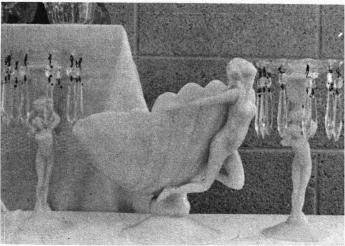
Windsor blue was introduced for the fall, 1937. From China, Glass and Lamps, July 1937: "also new is Windsor Blue, a tone of icy blue in opaque glass, appearing in a small group of decorative items in the [Sea]shell shape". Since we found no other references to Windsor blue and since this is a fairly scarce color, I am assuming that it did not sell and, therefore, was produced for no more than 6 months to a year.
Windsor is lighter than Azurite and examples can be seen in Bennett Color, plate 1, row 3; plate 24, row 3, items 1-2, and plate 45, row 2, items 1 and 5; Welker Color I, plate 4, row 4, items 1-3 and row 5, items 1-3 (note: I personally question item 4); and Welker Color II, plate 8 row 1, items 1-3. You may have noted that all of the production items shown were from the Seashell line except the nude candlesticks. But the candlesticks were sold as part of the Seashell line as well as part of the Statuesque line thus all proven Windsor comes from the Seashell line.
Next time we will begin our discussion of the transparent blues.