It May Not Be "Pomona" in More Ways than One
by Les Hansen
Issue No. 457 - April 2012
In a recent issue of the Crystal Ball, solid evidence was provided that Pomona Green was the name used by the Cambridge Glass Company for the opaque color from the 1920s for which collectors had assigned the name "Avocado". Similarly, Cambridge glass researchers have found no factory records, price lists, comments in trade journals, or advertisements of any kind that used the word "Pomona" to describe glass made by Cambridge.
So, how did the name "Pomona" become assigned to a treatment of crystal glass done by the Cambridge Glass Company in 1917-18? We assume the name "Pomona" was assigned (like "Avocado") by early Cambridge glass collectors. The treatment happens to have a vague similarity to glass named Pomona and made in the 1880s by the New England Glass Company, Boston, MA.
Only two references to the "Pomona" treatment by Cambridge have appeared over the years in the Crystal Ball. The earliest was in the July 1973 issue (#3) within a general article on early production lines of Cambridge written by John C. Wolfe, Jr. He commented: Pomona pieces
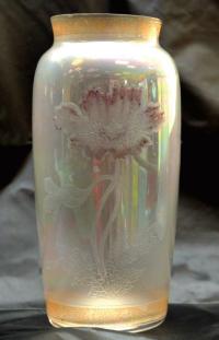 Photo 7 |
No other mention of "Pomona" occurred in the Crystal Ball for 21 years until the July 1994 issue (#255), when Editor Sue Rankin responded to a question from NCC member Elizabeth Moe about this treatment. Sue commented: Pomona was not included in the NCC color book because, as your quotation from John Wolfe's article explains, Pomona is not a color. It is a decorative technique applied to crystal glass. As John stated, it is very rare, probably due to the labor intensiveness of the decoration and, I assume, the high price.
In all of the research material that we have amassed, we have never found the name Pomona used. We did find the following quote from the January 14, 1918, issue of China, Glass and Lamps [a trade journal]:
"When one enters the Cambridge Glass Company's display in Room 728, one could easily imagine going into a veritable crystal palace. The company's latest creation is the decorated, 'Venetian' and 'Sateen o' Pearl' lines. These are certainly all that is claimed for them and must be seen to be appreciated. The 'Moonlight', a sort of iridescent ware, is also a nice line."
We never have absolutely identified the items mentioned in the article quoted. Keeping in mind that this is a reporter's comments on what he saw, we cannot take the three quoted names as gospel. [However,] in the same issue of China, Glass and Lamps, an ad appeared which mentioned "Sateen o' Pearl". The ad was repeated in the January 21, 1918, issue, and a variation of the ad appeared in the January 28, 1918, issue.
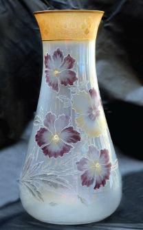 Photo 8 |
"Two leading features of the Cambridge Glass Company's display are gold-encrusted decorations and transparent encrustations – the latter also to be had in a mother-of-pearl finish."
In the January 31, 1918, issue, they stated:
"Buyers for stores catering to a discriminating class of trade will be particularly attracted to several very high-class decorations. One of these, a delicate frosted iridescent glass, to be had in several odd-colored band treatments, and somewhat suggestive of Venetian ware, provides an exceedingly salable assortment of items. The same glass is also shown with various designs etched in colors."
Based on the above, I believe it is fair to assume Cambridge named the glass (which we call "Pomona") Sateen o' Pearl.
In the 38 years since John Wolfe's comments in 1973 and the 17 years since Sue Rankin's comments in 1994, we have learned much more about this special treatment of glass by the Cambridge Glass Company. Indeed, Cambridge produced crystal blanks (apparently, mostly vases) in 1917-18 that were treated internally, so they became semi-opaque with an iridized appearance on the external, shiny surface. Generically, what resulted was referred to as pearl glass by the glass manufacturers of the time. These blanks were further decorated with etched borders and/ or floral designs.
That is the good news! However, we also have learned the H. P. Sinclaire & Company, Bath, NY, made glassware in the 1920s with floral decorations (Red Poppies, Gold Poppies, Yellow Daisies, Clematis, and Zinnia) on crystal blanks with an iridescent pearl finish. This Sinclaire glass has often been confused with the Cambridge Glass Company's glassware of the late 1910s that has been referred to as "Pomona". As it turns out, the vast majority of "Pomona" items in Cambridge collections today were made by Sinclaire in its Pearl line instead of by Cambridge.
Sinclaire & Company produced premium glassware of the highest quality, and the company and its products are thoroughly reviewed in two books (Volumes I and II) entitled, H. P. Sinclaire, Jr., Glassmaker, authored by Estelle Sinclaire Farrar, a granddaughter of H. P. Sinclair, and published in 1974 and 1975. The books are out of print, but are frequently available on eBay. Sinclaire & Company didn't produce full-blown catalogs with regularity; however, they issued catalogs in both 1924 and 1927, and both of those catalogs included their glassware called Pearl. To quote from Farrar, Volume II:
Sinclaire & Company's Pearl glassware used the Best Flint [29% red lead] glass. It was made by spraying the inside of the hot piece with a metallic liquid that the craftsman called "aurene". This gave the glass a faint iridescence and satin-finish interior. The untreated exterior kept its shine. The glass was semi-opaque.
Red Poppies and similar colored designs appeared on Pearl during the early 1920s. The design was first acid-outlined, and then shaded by brushed-on acid. Masking of the undecorated surface followed, and then the piece was acid-dipped. A final acid-brushing added further shading. The Sinclaire designs also called for hand-staining and firing. These colors are transparent, except for a few gold highlights [especially butterflies]. In addition to Red Poppies, Gold Poppies, Yellow Daisies, and Clematis, shown in the catalogs, there was Zinnia.
The production process used by Cambridge was likely similar to Sinclaire's process to make Pearl with Poppies, Daisies, Clematis, or Zinnia. However, some key differences exist in the glass produced by the two companies. Cambridge's production apparently preceded Sinclaire's production and may have been limited to 1917-18 and, perhaps, shortly thereafter; therefore, very little of Cambridge's glass of this sort has surfaced. On the other hand, Sinclaire's Pearl with floral decoration was produced from at least 1924 to 1927 and likely was produced before and after those dates. Therefore, Sinclaire's Pearl with floral decoration is much more plentiful today than is Cambridge's "Pomona".
The distinct differences between the production from Sinclaire and Cambridge revolve around overall quality. Lynn Welker and I compared notes, and we have concluded the following:
1. Sinclaire items have a heftier weight because they have thicker glass and, perhaps, because of their 29% lead content.
2. Sinclaire items have a smooth bottom with the pontil mark polished out, whereas Cambridge items have remnants of the pontil mark on the bottom.
3. Sinclaire items have a finished (rounded) top that was likely smoothed with a tool, whereas Cambridge items were simply ground down on top to form a flat top edge.
Also, Sinclaire's Pearl isn't found in the recognizably-shaped blanks made by Cambridge. Most blanks for vases produced by Cambridge around 1917-18 should appear on pages 102 and 103 of Welker's Book II of reprints of old company catalogs. In other words, most should have the shapes we are familiar with from the 1920s that were used for Cambridge's opaque colors.
Please don't be disheartened to learn your "Pomona" by Cambridge is actually Pearl by Sinclaire. Glass made by Sinclaire is very high-quality and extremely collectible. I believe Sinclaire Pearl was more expensive to produce than Cambridge "Pomona" because of the high quality ingredients in the glass formula and a high level of craftsmanship. Furthermore, glass made by Sinclaire was sold in the most exclusive department stores in the country, including Tiffany & Company.
The Cambridge "Near Cut" trademark wasn't placed on items blown in molds, and the C-in-atriangle trademark wasn't introduced until 1922. Therefore, none of Cambridge's items of this sort is signed. Unfortunately, most of the items made by Sinclaire that surface today also lack a trademark. From Farrar, Volume I:
Sinclaire's idealism required that his glass be trademarked only after it passed inspection. Twice a year, the unmarked seconds went on sale at the factory for 25 cents each [compared to $9 to $30 per piece for items that were signed – an extremely high price in the 1920s]. Perhaps, a flower stem began a fraction of an inch too high. Or, perhaps, the blank was slightly awry. This post-inspection signature is worth remembering. Thousands of seconds have found their way to dealers.
Photo 1Sinclaire designed his S-in-awreath trademark before the factory opened. The wreath is laurel, symbol of peerless quality. A shield interrupts it at each side. A second trademark has the name SINCLAIRE in capital letters. An occasional piece bears both trademarks.
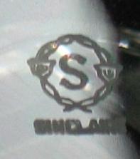
An example of the double Sinclaire trademark is in Photo 1, but most pieces of Sinclaire that surface today lack a trademark. Next, we will review examples of glass from the alternative companies. First, Photo 2 has the likely namesake for "Pomona" by Cambridge that was assigned by early collectors – a Pomona tumbler made by the New England Glass Company. You will notice the vague similarity to the type of glass we are discussing.
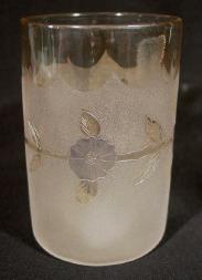 Photo 2 |
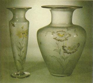 Photo 3 |
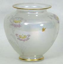 Photo 4 |
Photo 3 is reproduced from Farrar, Volume II, and it displays a 12" vase (on the left), which is the Sinclaire blank #3401 in Pearl with Yellow Daisies, and a 12½" vase (on the right), which is the Sinclaire blank #3405 in Pearl with Red Poppies. Next, the vase in Photo 4 is the Sinclaire blank #3375 – also in Pearl with Red Poppies – beautiful, huh?
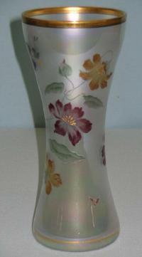 Photo 5 |
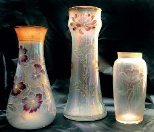 Photo 6 |
Photo 8 (also near the beginning of this article) has a close-up of the medium-height vase in the Museum, and it's the 8" Cambridge blank #2357 with a floral decoration, which may contain pansies. The border etching on top that is covered with gold is extremely similar to Cambridge's border etching #625, and it shares the "cobblestone" background of two border etchings by Cambridge (#519 and #625). Some border etchings (including #620 and #622) from this time period have not been identified and, with its tremendous similarity to border etching #625, this border etching may very well be one of those. This vase is light-weight – it speaks "Cambridge". The 8" vase in Photo 9 is identical in shape and size to the medium-height vase in the Museum (Photo 8) and has the identical border etching on top that is covered in green enamel in this case. This vase was on display and discussed during the Bring & Brag session at this year's NCC convention. Although it lacks a floral decoration, it has the pearl treatment and was likely made by Cambridge. The vase in Photo 9 is shown with a close-up of the border etching in Photo 10 and, indeed, the border etching is identical to the one that appears on the vase in Photo 8 (near the beginning of this article).
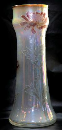 Photo 11 |
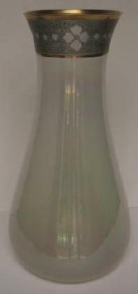 Photo 9 |
So, was your "Pomona" vase made by Sinclaire or Cambridge? It was likely made by Sinclaire if it is relatively heavy in weight, has a polished bottom, has a smooth top edge, and has a shape that isn't recognizably Cambridge. It was likely made by Cambridge if it is relatively light in weight, has remnants of a pontil mark on the base, and has a top edge that was ground flat rather than smoothed. Of course, a border etching that can be attributed to Cambridge provides certain identification, as does a trademark by Sinclaire.
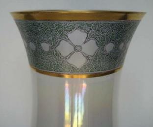 Photo 10 |